In the previous part, we learned about typography and how it is useful for a UI designer. Now, in the concluding part, we will learn about typography principles and their useful tips.
Expected Readers:
Those who are interested in learning more about typography, aspiring designers, typography enthusiast, graphic and user interface designer. Continuing with the last part, we will learn some principles and their tips that you can use in your UI design practices. Learning and mastering them is not easy but you can go ahead gradually.
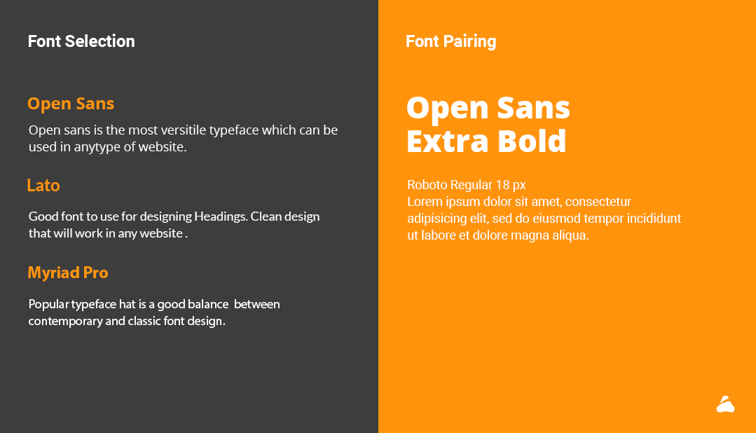
Font Selection
Making a right font selection is like choosing a right outfit as it speaks a lot about your taste and style. Font selection varies for different projects. Boldness, size, and spacing determine which areas will attract most of the attention.
Tips
Think about position and alignment of your font.
Check which font is suitable for your brand and style that way.
Play with different font sizes and make sure that the text is easy to read.
Font Pairing
Font pairing means usage of two different fonts and combining them into a typeface. There are basically three types in which font pairing can be included.
- Concordance: Using a single typeface
- Contrasting: Using two or more typeface that is different but goes well together.
- Conflicting: Two typefaces which are similar to one another to work.
Tips
- Try to establish a visual hierarchy
- The mixture of serif and sans serif is always eye pleasing.
- Avoid pairing too similar fonts.
- Make content important while ensuring user’s
- readability and simplicity of the content.
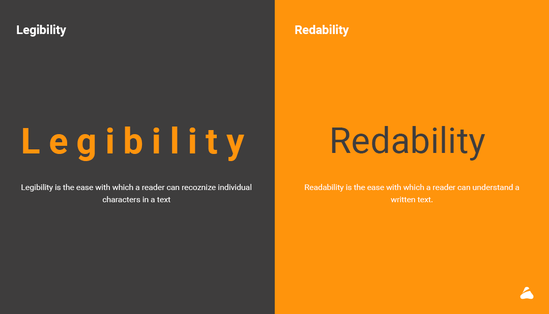
Legibility
Legibility is the pattern wherein a reader can recognize individual characters in a text. It is a measure to distinguish one letter from another in a particular typeface. Legibility is different than readability.
Tips
Fonts with taller X Height are easy to read. Fonts like Dejavu sans book, Libre Baskerwille Regular, Merriweather san s Light have a taller X Height.
- Avoid using all caps and always be creative with your design.
- Always remember to choose text with proper contrast.
Readability
Readability is the ease with which a reader can understand a written text. There are some important points that should be taken into consideration.
- The minimum type size for readability should be 16 points.
- The paragraphs should be no longer than 5-6 Lines.
- Black type on a white background has the best readability.
- Use serif fonts content and sans-serif for headlines.
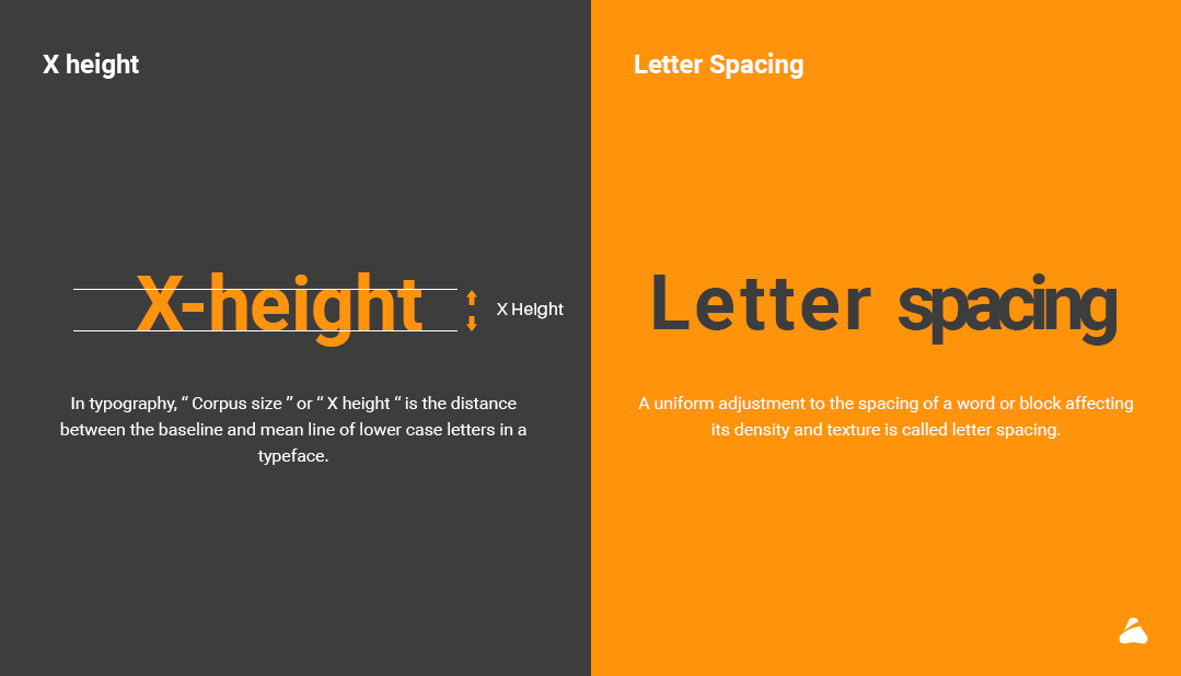
Height (X height)
Being equal to the height of the lower-case letter ‘x’, X height is the distance between the baseline and mid line in a typeface in typography. This height is a relative unit of measuring the proportion of lowercase letters.
Tips for X-Height
Always choose different line spacing for different typefaces.
Software’s like Photoshop, Illustrator, and InDesign are the best software to adjust leading or X-Height
Letter Spacing
A uniform adjustment to the spacing of a word or block affecting its density and texture is called letter spacing. In other words, adjustment applied to a block of text or paragraph to increase or decrease the average distance between line.
Tips for Letter Spacing
- The most important thing for letter spacing is typeface as every typeface requires its own adjustments and spacing.
- Also remember that Word Spacing is also important in typography to increase readability.
- By choosing right corning your design will improve
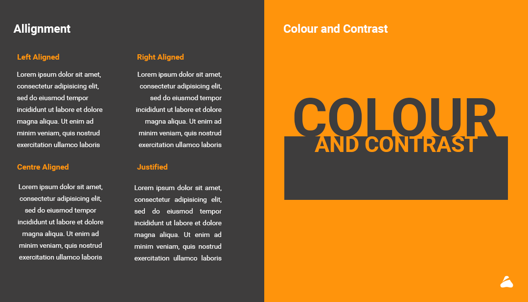
Alignment
Alignment means how text is placed on the screen in relation to margin. It’s also a process that allows the user to align text on a page or document.
For example: Left-aligned text aligns text to the left side.
Tips for Alignment
- Always or mostly align your paragraphs from left to right as it is the standard way in which our eye’s read.
- Avoid widow and orphans in the paragraph by using or adjusting type size, word or letter spacing etc.
Colours and Contrast
Colours and contrast also play an important role in typography. Colours can help to set the mood for your design and helps the text to stand out. The three integral components of the colour are:
- Hue: The shade of colour.
- Saturation: The intensity of colour in an image.
- Value: Lightness and Darkness of colour.
Tips for colour and contrast
- We need to remember that
” Sharp contrast is easy to read, pure contrast is hard to read” - Choose font colour and background properly to make your design standout.
- For example, use white text on the red or black background to increase readability.
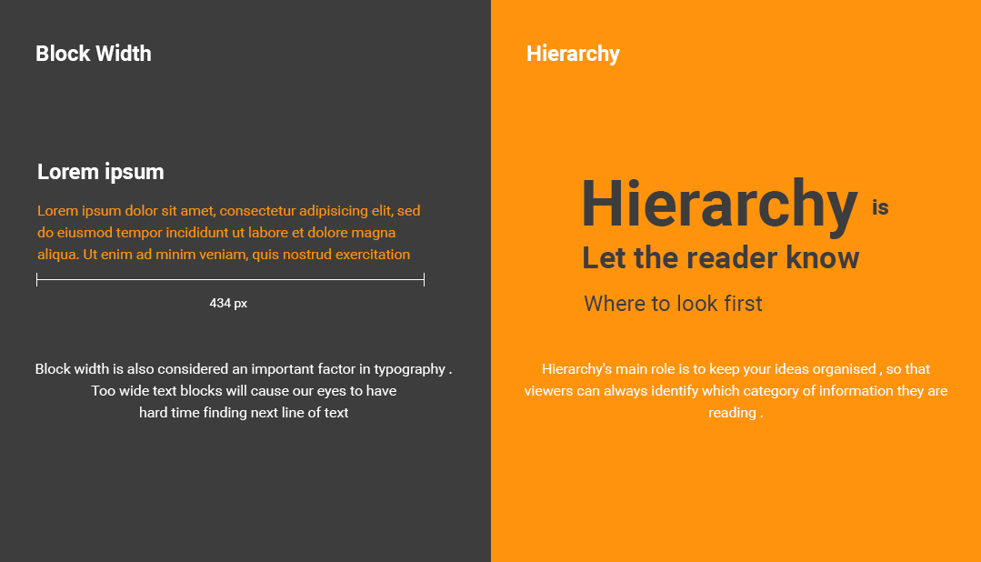
Block Width
One of the important factor in typography is Block Width . Due to wide text blocks it hard for the reader to find the next line . If lines are too narrow the eye will need to jump from line to line breaking the reading rhythm. Your text line should only have 50 to 75 characters.
Tips for Block Width
- First, all of the paragraphs should be aligned left as its the standard practice to read.
- Block width should be not extended more than 700px as the user is not fond of reading the whole sentence, the sentence needs to be broken.
- Maximum 14 words should come under 1 line in a paragraph
Hierarchy
The main role of hierarchy to create a hierarchical division that can show users where to look for specific kinds of information. For this we can use size ,fonts and different pieces of text for creating hierarchy. Using them we can direct the users attention to that information which is important.
Tips for hierarchy
- Always set rules for bold and italic in typography to maintain the visual hierarchy. For example, the heading should be bold and bigger as compared to paragraph to make it highlight.
- For maintaining hierarchy, always create a Z pattern as it is the common reading pattern.
- Font weight also helps in maintaining visual hierarchy in typography
- 4. Don’t use too many typefaces in a single design as the visual hierarchy gets disturbed.
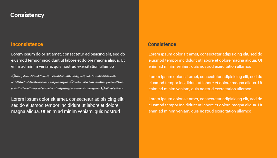
Consistency
Consistency refers to the constant use of visual design elements discussed such as colour, type, spatial layout etc. Using consistency in typography means using right font and font sizes for heading and body text style. There should be consistent use of typeface, kerning, leading and colour etc.
Consistency makes the work look beautiful and pleasing to the users’ eye. It helps in minimizing styling and reduces user memory. It also helps HTML developers to make the website optimized.
Tips for consistency
Do not use too many typefaces due to which the consistency will get hampered.
Use one or two typefaces which makes design consistent and minimal.
Accessibility related to font size
After understanding the principles of typography, you need to know about the varied age group of users. You will have to keep in mind the following points of principles and design.
There are mainly some limitations of human eyesight after a specific age that is 45-60 and further,
Loss of light
Human vision declines and pupil shrinks as the age advances, allowing less light to enter the eye. Due to this the human faces problem in the low light environment.
Loss of Focus
Loss of focus refers to the loss of elasticity of eye lenses making it less able to focus while reading. The amount of loss of focus differs from individual and can range from slight to severe.
Vision Field Loss
Eye diseases such as macular degeneration, which is the loss of vision in the center of the visual field. It can cause blurred vision and faded colour.
Here are the principles of Typography while designing for senior or aged people.
Typestyle
Use simple and easy to read font. You must avoid decorative or script fonts as it will be hard to read for aged people.
Type or Font Size
Use text size generously with extra leading to improve readability. For example, a minimum leading of 16 on 14 Pt text is a good rule of thumb. Your sizes can vary as per your typeface.
Text Length
The text length or block width should be divided into small parts as it will be easy for aged people to read and understand. Always use highlighter or bullet points to increase the readability.
White Space
Use lots of white space which will reduce eye strain.
Colour
Black text on white background or on a very light background is better for aged people as using other colour will be a trouble for them.
Guidelines of Bootstrap for Typography
Bootstrap global size font size is 16 px and line height of 1.5
Bootstrap 4 styles HTML headings with a bolder font and increased font size:
h1 Bootstrap Heading 36 pixels
h2 Bootstrap Heading 30 pixels
h3 Bootstrap Heading 24 pixels
h4 Bootstrap Heading 18 pixels
h5 Bootstrap Heading 14 pixels
h6 Bootstrap heading 12 pixels
The Default font family is “Helvetica neue”, Helvetica, Arial , Sans – Serif
Display headings are used to stand out more than normal headings with larger font size and font weight
Display 1 – Font Size 96
Font Weight 300
Display 2 – Font Size 88
Font Weight 300
Display 3 – Font Size 72
Font Weight 300
Display 4 – Font Size 56
Font Weight 300
Here are the resources you can use to update your knowledge
https://blog.prototypr.io/how-to-use-typography-in-ui-design-ce045fa4ff2e
https://uxplanet.org/typography-in-ui-guide-for-beginners-7ee9bdbc4833
https://medium.muz.li/typography-in-mobile-design-15-best-practices-to-excellent-ui-5eaf18280ad
https://medium.muz.li/5-requirements-of-ui-ux-designer-be5cec493228
https://medium.com/gravitdesigner/typography-elements-everyone-needs-to-understand-5fdea82f470d
https://www.marketing-partners.com/conversations2/vision-changes-typography-for-aging-audiences
https://www.fonts.com/content/learning/fyti/situational-typography/designing-for-seniors
1 thought on “Typography basics and yips for User Interface (UI) design – Part 2”
Comments are closed.