Redesigning Optellix.com
Okay, so imagine this: You meet a company that builds mind-blowing 3D tech… but their website looks like it hasn’t updated itself since the Nokia ringtone era.
That was Optellix.
Optellix is a rockstar 3D technology company that creates immersive apps for engineering, medical, construction, e-commerce, and basically every industry that requires complex 3D visuals. They build 3D viewers, CAD tools, XR experiences… the good stuff that makes engineers geek out.
But the problem was simple. Their work screamed the future, but their website quietly whispered "past".
That’s when our team at Prismic Reflections jumped in.
And somehow, I became the Senior Visual Designer who had to turn 3D rocket science into a website normal humans can use.
Fun journey. Lots of chai. Zero regrets.
What we signed up for

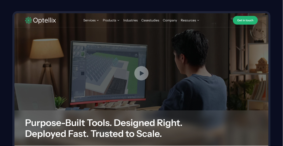
Optellix wanted a full makeover. New structure, new UI, new vibe, new everything.
The goal was very clear:
Make a website that is modern, easy to understand, mobile-friendly and actually helps them generate leads.
Basically, a site that makes CXOs feel confident and tech teams feel respected.
And yes… something that actually looks like it belongs to a 3D company.
The people we had to impress
This part was tricky. We weren’t designing for random web surfers.
We were designing for:
- CXOs who scan content faster than you swipe reels
- VPs who judge everything
- 3D developers who zoom into pixels like it's their birthday
- And people who work with CAD all day
So the website had to be smart but not scary, technical but not boring, and modern without blinding users with glowing neon gradients.
Challenge accepted!
Why the old website needed therapy
The old site had issues like:
- Too much technical text
- Too little visual storytelling
- Unclear navigation
- No flow
- No energy
- Zero representation of the actual innovation they do
It felt like someone was trying to describe Iron Man but only using black-and-white stick figures.We knew we had to bring clarity, personality and a proper story to the brand.
The fun part… after all the stress
Step 1: Fix the content structure
We reorganized content so users can understand what Optellix does in the first 5 seconds. Nobody has time for decoding paragraphs.
Step 2: Build trust
We added metrics, client logos, testimonials and case studies. Basically, all the proof that says "Yes, these people know what they're doing".
Step 3: Add emotions, not just engineering
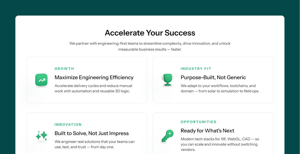
We used a lighter color palette with greens and white so the site feels bright and welcoming. Rounded fonts and rounded boxes created a friendly, modern look.
It's like giving the brand a hug without being weird.
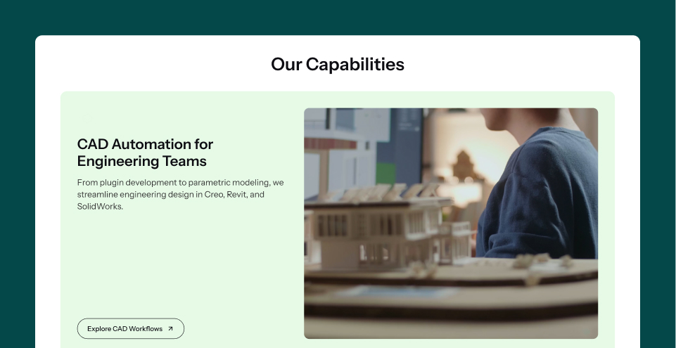
Step 4: Show technical expertise visually
Instead of dumping text, we used:
- Videos clips
- Subtle 3D elements
- Real product screenshots
- Animated icons
- Clean diagrams
This made the content easy to digest even if you’re not a CAD genius.
Step 5: Make it lead friendly
Clear CTAs, clear messaging, and a flow that guides users naturally. No confusion, no guessing.
Step 6: Keep performance in mind
Since the site was going into Webflow, we made sure animations were subtle and everything was lightweight.
Your laptop deserves love too.
The Impact: and yes, we’re proud of it
Here’s where it gets interesting.
A good-looking website is nice, but a website that boosts business? Even nicer.
The redesigned Optellix website now:
- Looks 10x more modern and aligned with global 3D tech standards
- Creates instant clarity for first-time visitors
- Reduces bounce rate because the content is simple and visual
- Guides users smoothly towards CTAs, improving lead generation
- Helps CXOs understand Optellix’s value in minutes
- Helps 3D developers see the technical depth without scrolling forever
- Shows their products and solutions in an engaging, credible way
- Positions Optellix as a premium, innovation-first technology partner
- Makes the brand look more trustworthy and enterprise-ready
- Supports sales teams with clearer storytelling and stronger case studies
- Improves search friendliness through structure and better content hierarchy
- Strengthens brand perception in front of Fortune 500 prospects
- Sets a strong foundation for future marketing campaigns
And yes, it simply makes the company look like the futuristic 3D experts they actually are.
Final Thoughts
Redesigning Optellix wasn’t just a UI project. It was a transformation.
We took something highly technical and made it approachable, beautiful and meaningful.
And honestly, watching a complex 3D tech company finally come to life online…
That's the kind of thing that makes us designers do a little happy dance at our desks.
Now onto the next project.
Chai first, of course.