Logo Identity for Data Privacy & Data Protection Company
A' Design Award (Bronze)
Wins A’ Design Award in 2023 for Intelehealth App UX/UI Design
Project Brief
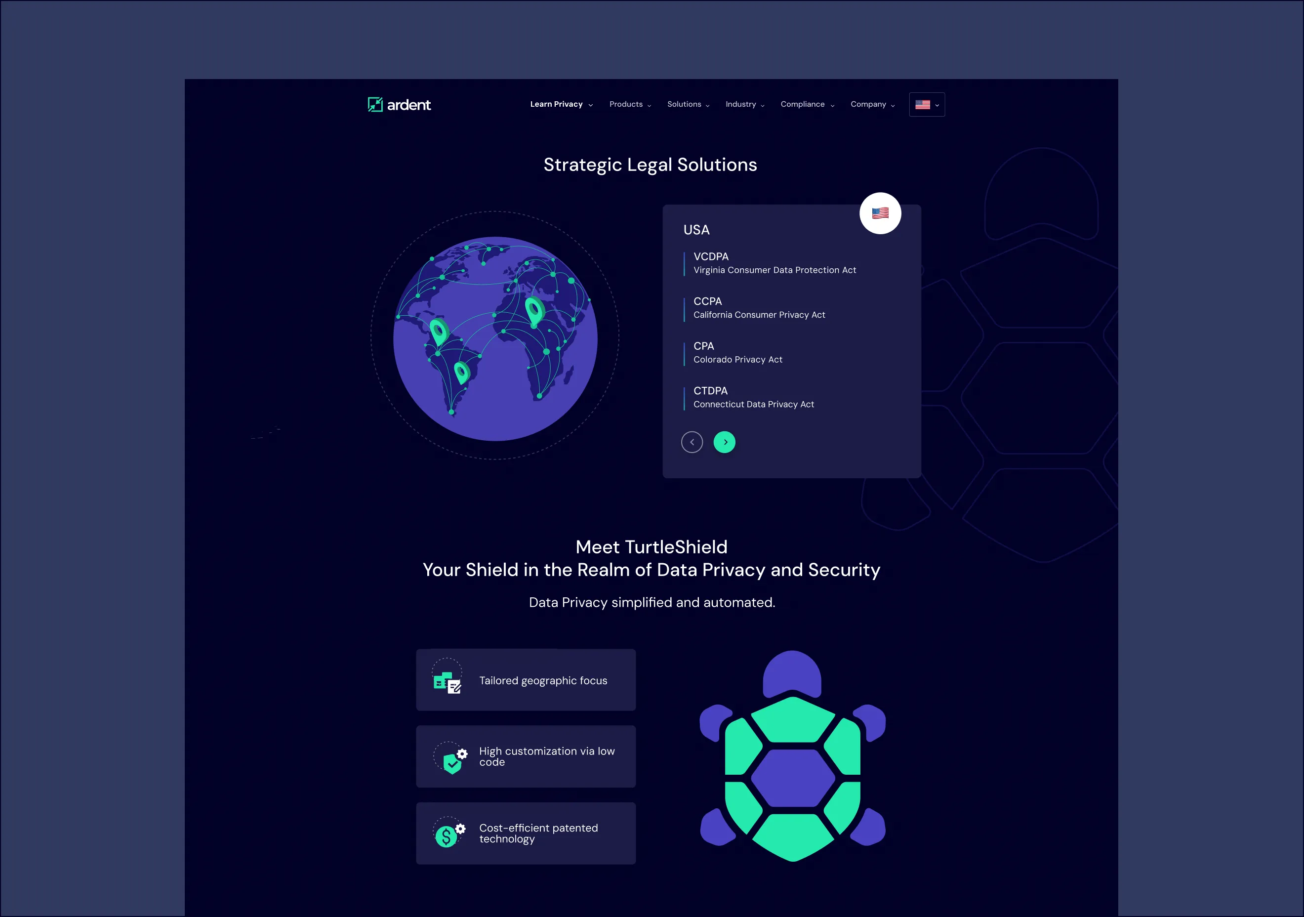
TurtleShield PA is a privacy assessment platform designed to streamline data collection and compliance workflows for enterprise privacy departments. Through a guided questionnaire approach, it simplifies the process of evaluating personal data usage and helps ensure alignment with global data protection standards. The platform notifies stakeholders of approvals or rejections, making data privacy management more transparent, accessible, and efficient.
As part of the branding and product identity initiative, our task was to create a logo and visual language that reflected the brand’s secure, innovative, and enterprise-friendly nature.
Heading 1
Heading 2
Heading 3
Heading 4
Heading 5
Heading 6
Lorem ipsum dolor sit amet, consectetur adipiscing elit, sed do eiusmod tempor incididunt ut labore et dolore magna aliqua. Ut enim ad minim veniam, quis nostrud exercitation ullamco laboris nisi ut aliquip ex ea commodo consequat. Duis aute irure dolor in reprehenderit in voluptate velit esse cillum dolore eu fugiat nulla pariatur.
Complex Subject Matter: Translating abstract concepts like data privacy, compliance, and minimization into simple, user-friendly visuals.
Balancing Innovation with Trust: The brand needed to appear modern and forward-thinking while also conveying trust, security, and maturity.
Visual Differentiation: The logo and branding had to stand out in a competitive privacy and security tech space, without relying on overused clichés like locks or shields alone.
Enterprise Appeal: The brand needed to resonate with mid-to-large enterprises that require clarity, control, and confidence in privacy tools.
Logo Brief
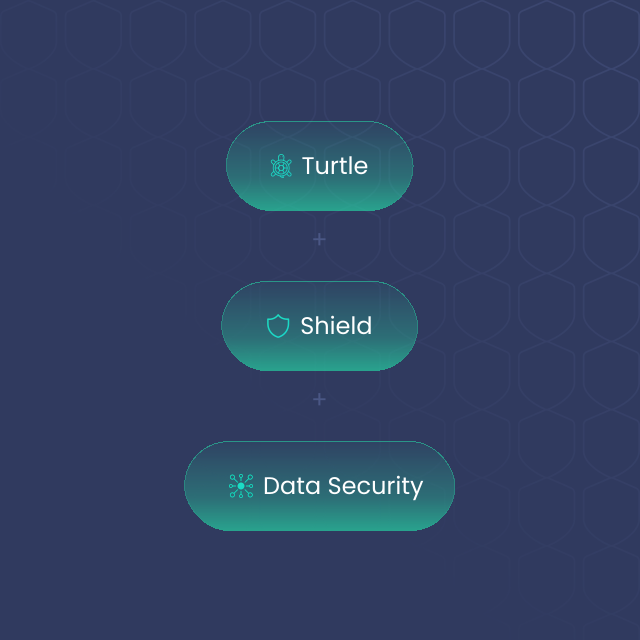
The TurtleShield logo should reflect the core brand purpose: to protect and streamline data privacy in a simplified and intelligent way. The turtle symbolizes protection and stability, while the shield represents defense and compliance. The overall form must feel secure, established, and smart—designed for enterprise-level clients, but with approachable simplicity.
Brainstorming
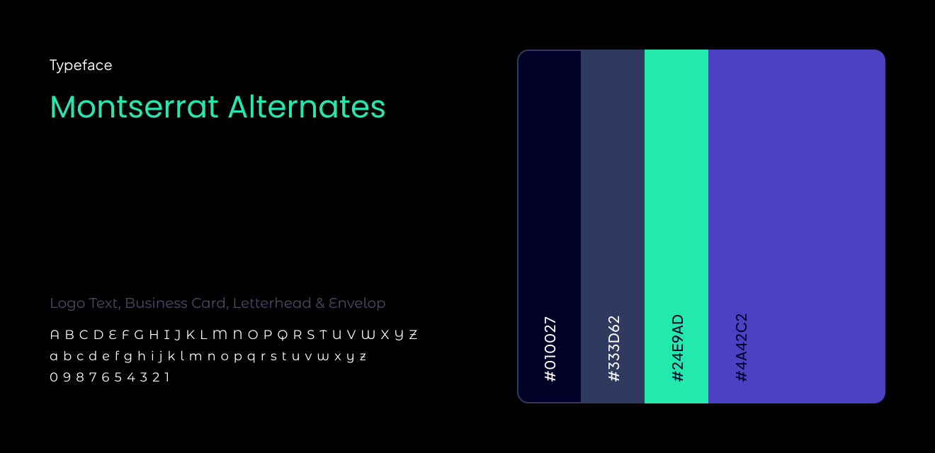
We explored visual motifs combining turtle shells (symbolizing natural protection), shields (representing defense and security), and data elements (like abstract nodes or digital grids). Typography was considered in a clean sans-serif form, evoking modernity and clarity. The focus was on geometric balance, bold-yet-minimal visuals, and strong iconography that can stand alone in both digital and print contexts. Colors were kept calm and professional—leaning into blues, dark teals, and muted grays—to signify security, intelligence, and stability.
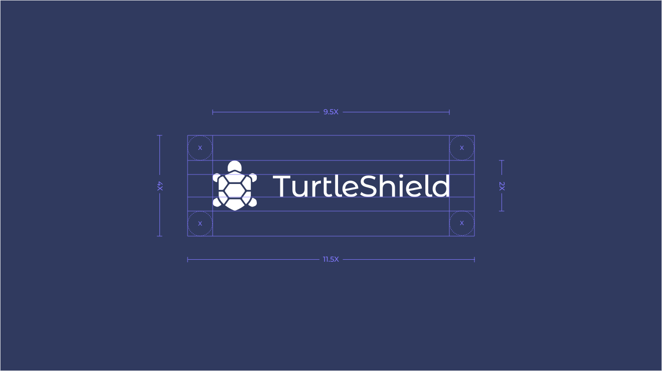
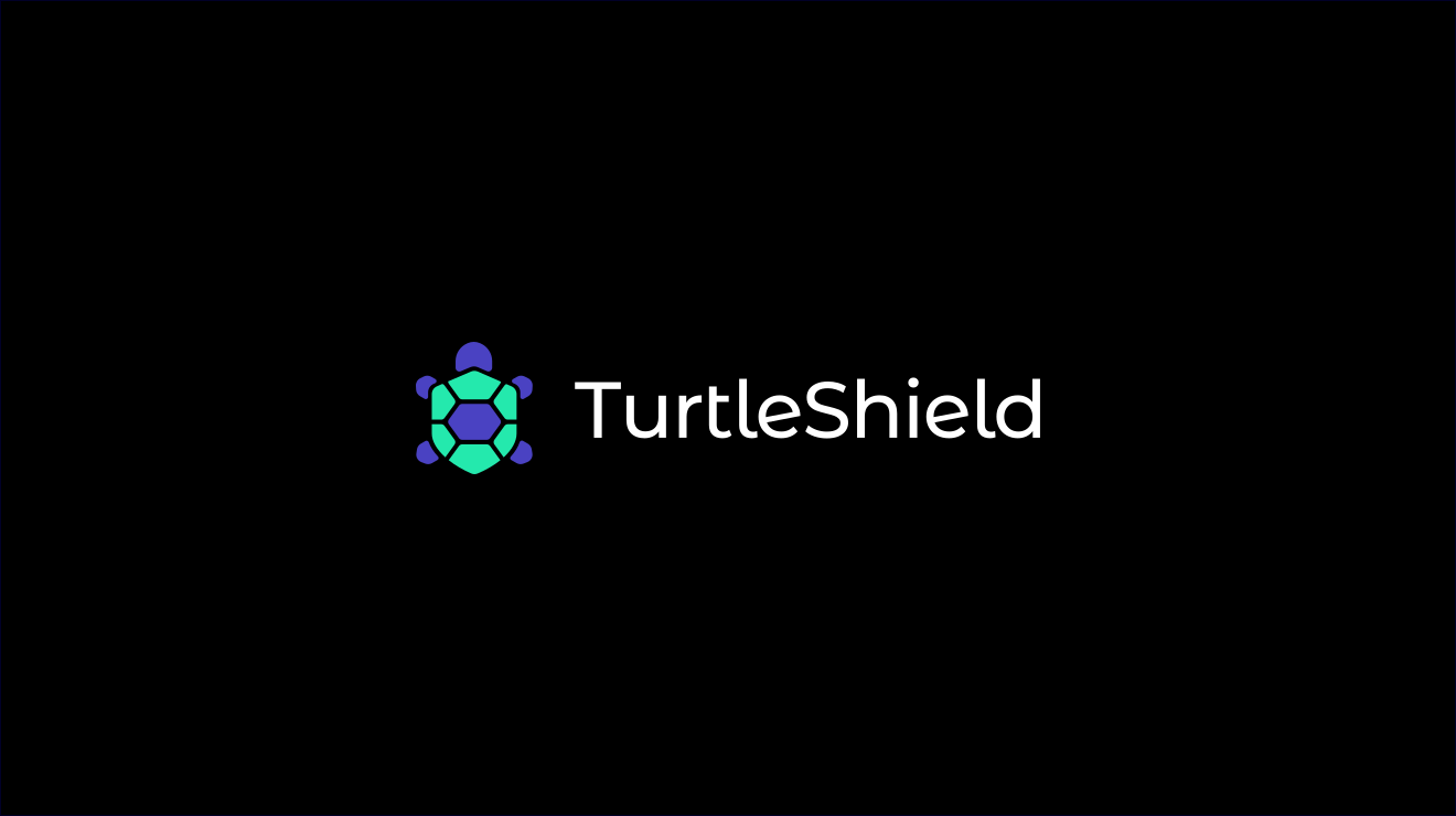
Logo Construction and Final Outcome
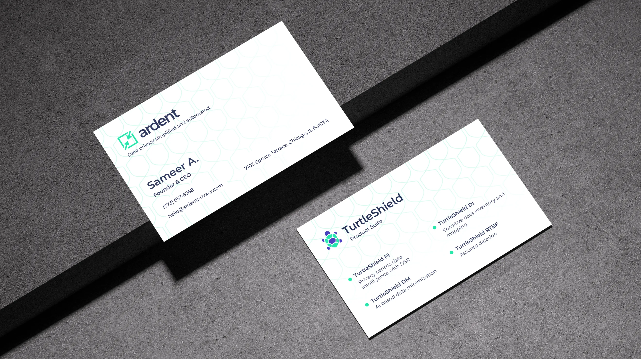
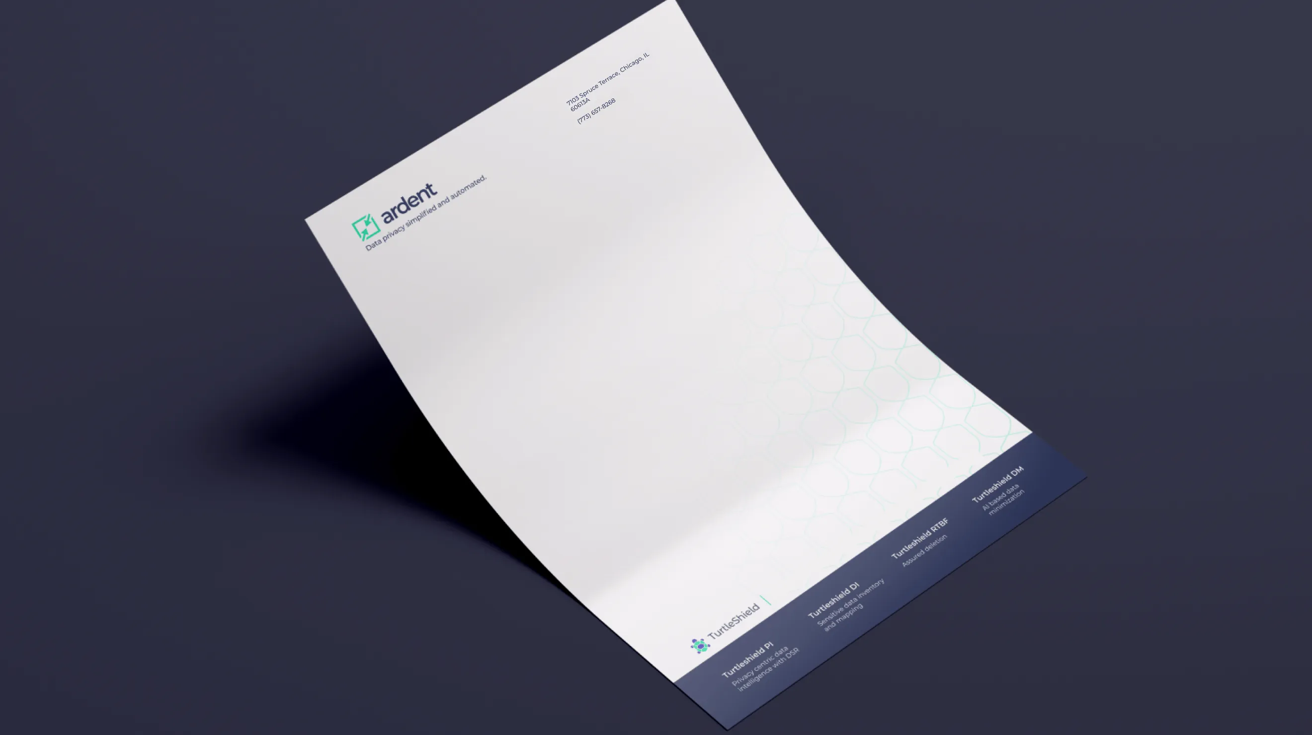
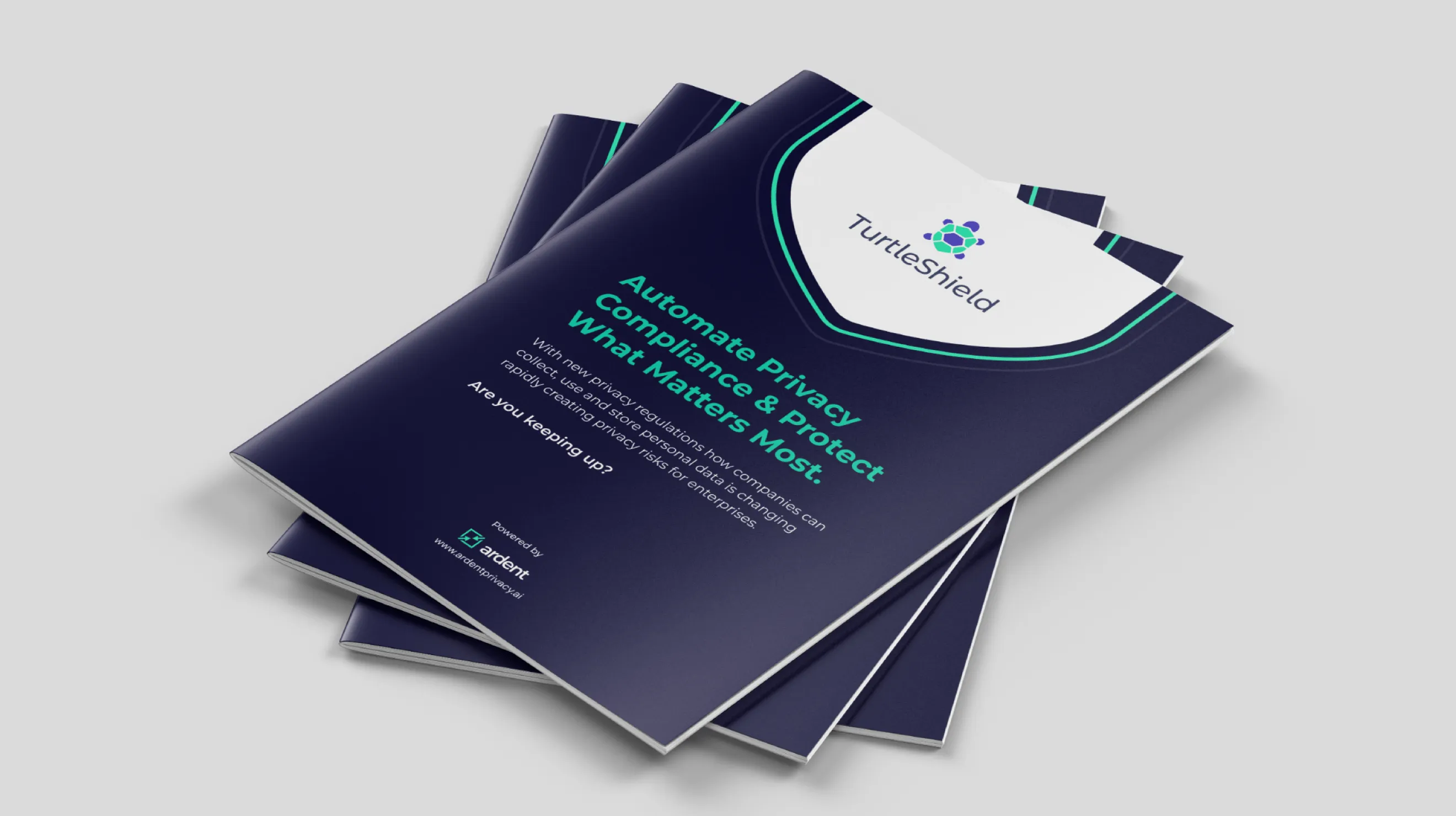
Brand collateral
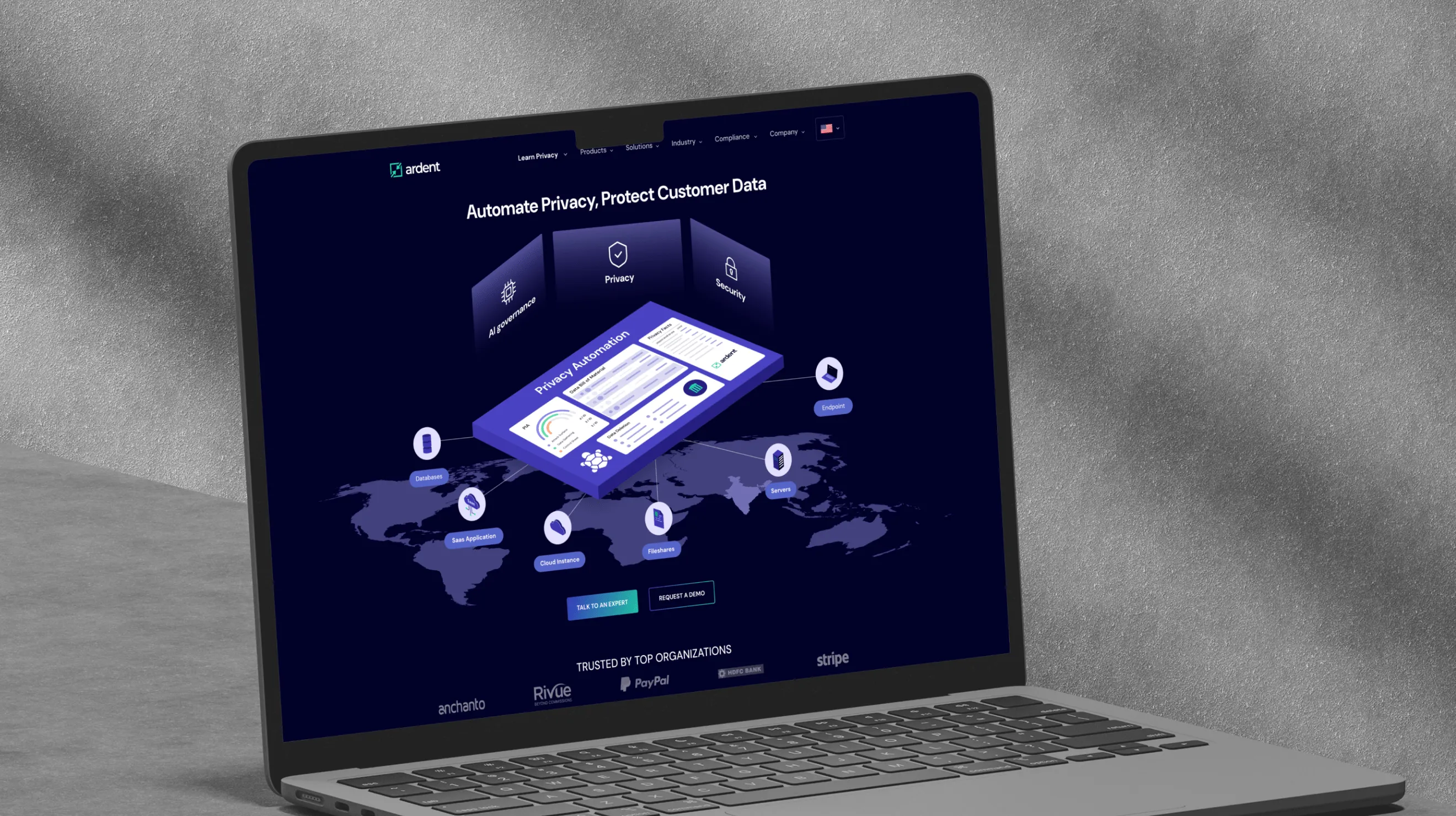
Website
Heading 1
Heading 2
Heading 3
Heading 4
Heading 5
Heading 6
Lorem ipsum dolor sit amet, consectetur adipiscing elit, sed do eiusmod tempor incididunt ut labore et dolore magna aliqua. Ut enim ad minim veniam, quis nostrud exercitation ullamco laboris nisi ut aliquip ex ea commodo consequat. Duis aute irure dolor in reprehenderit in voluptate velit esse cillum dolore eu fugiat nulla pariatur.
"Prismic really did a great job on understanding our requirements. What we liked specifically about Prismic Team is they invest a lot of time in discovery & design for our requirements, for product, marketing, as well has branding needs. We’re definitely happy to work with them once again for further design work."