


Prismic Reflections® is a principal-led, award-winning design studio that blends human empathy, strategic thinking & innovation to solve high-stakes business challenges through strategic design, from the past 23 years.

Wins A’ Design Award in 2023 for Intelehealth App UX/UI Design


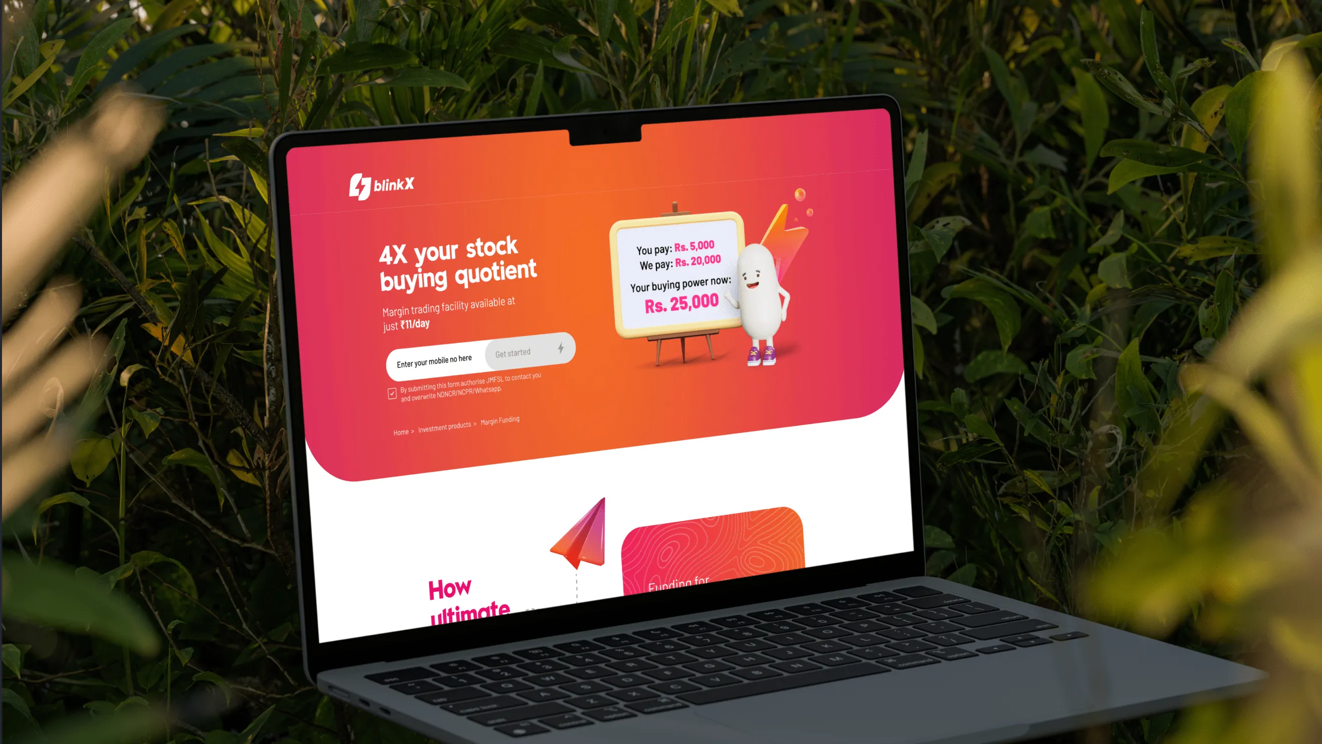
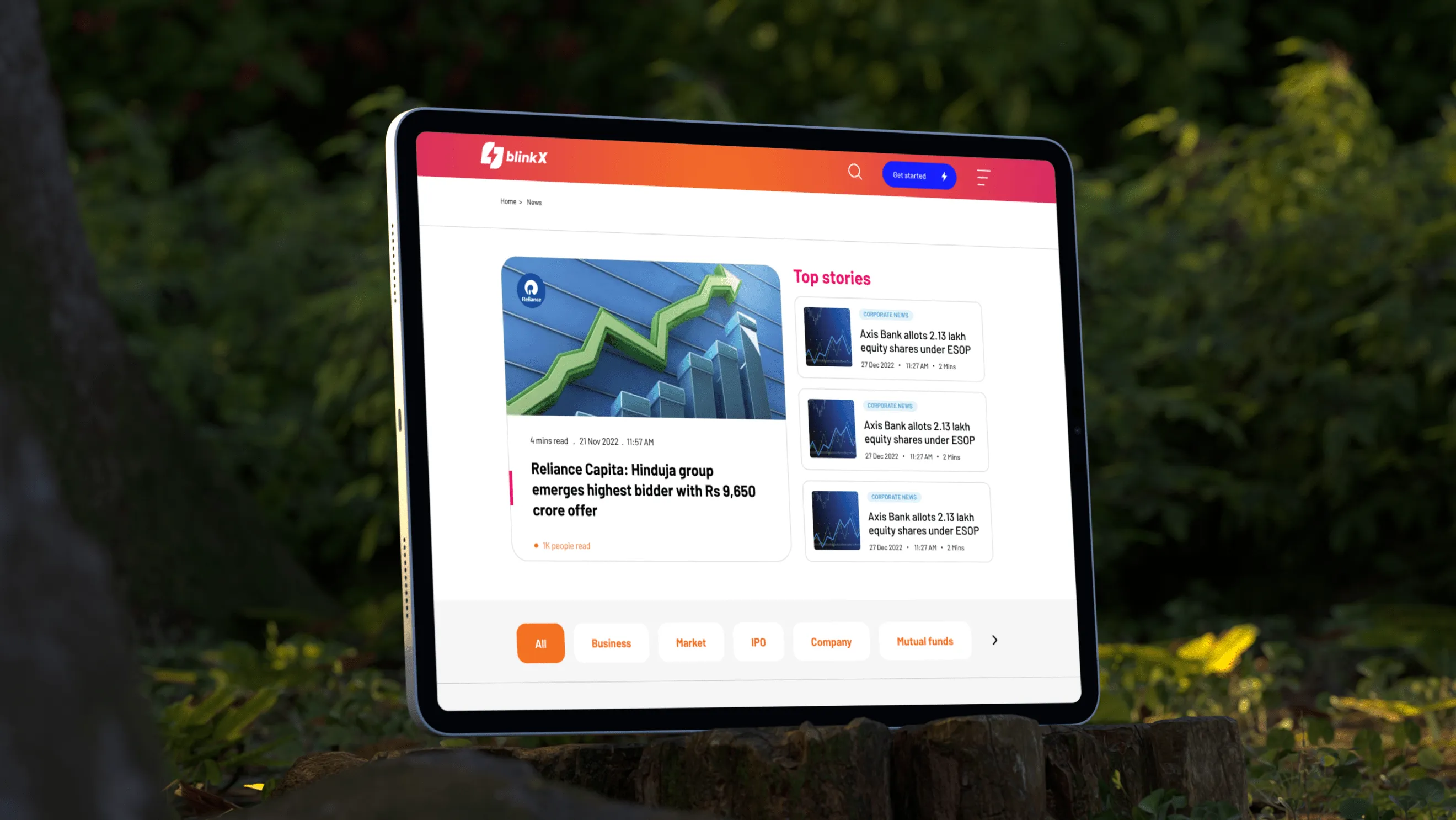
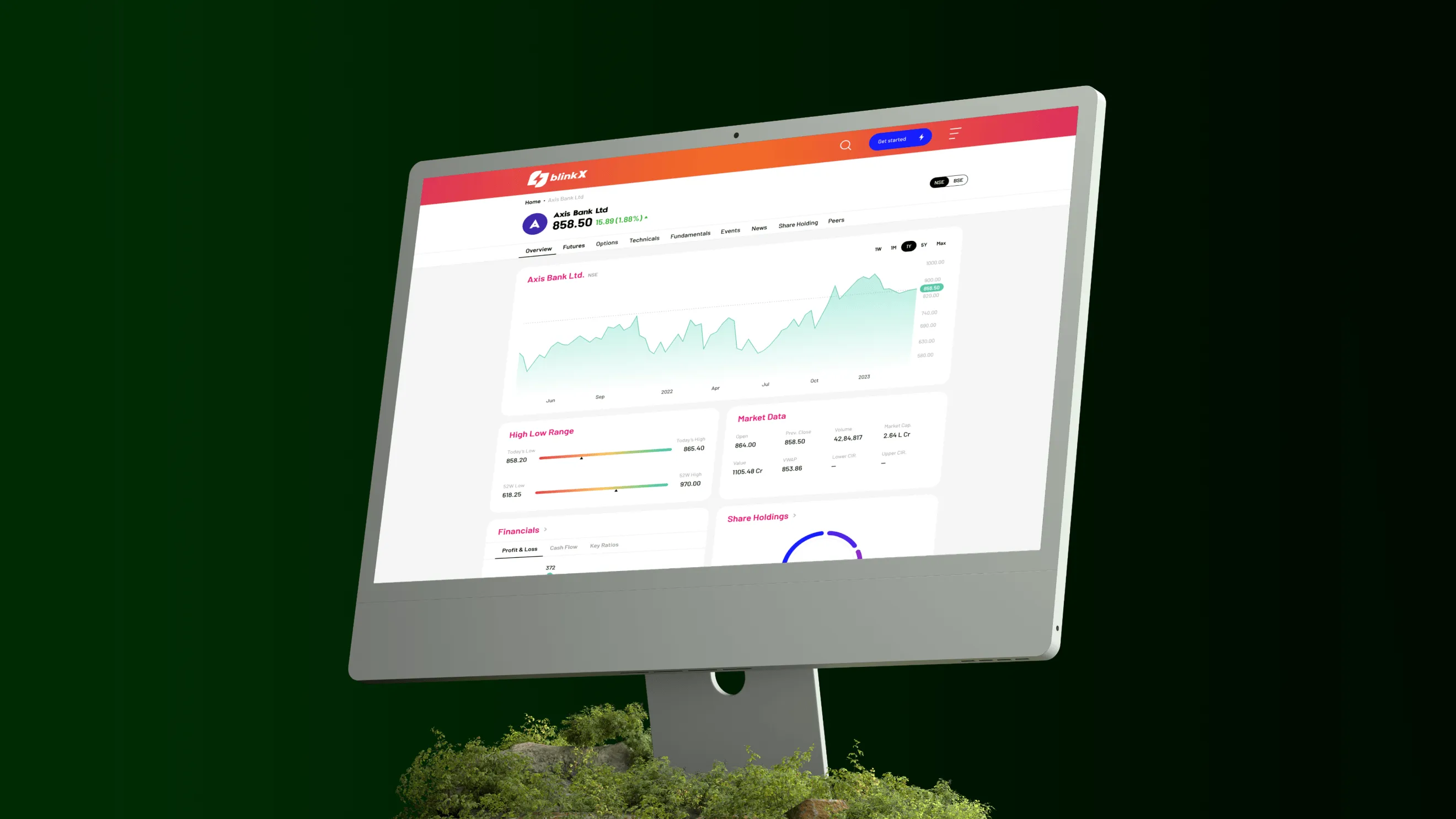
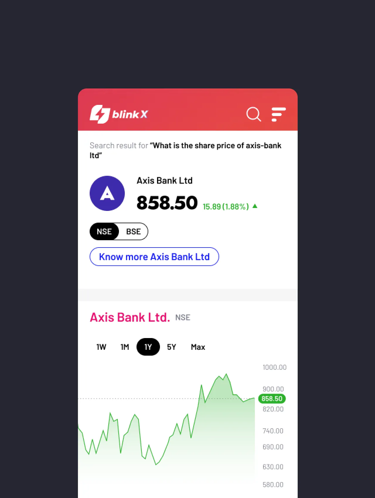
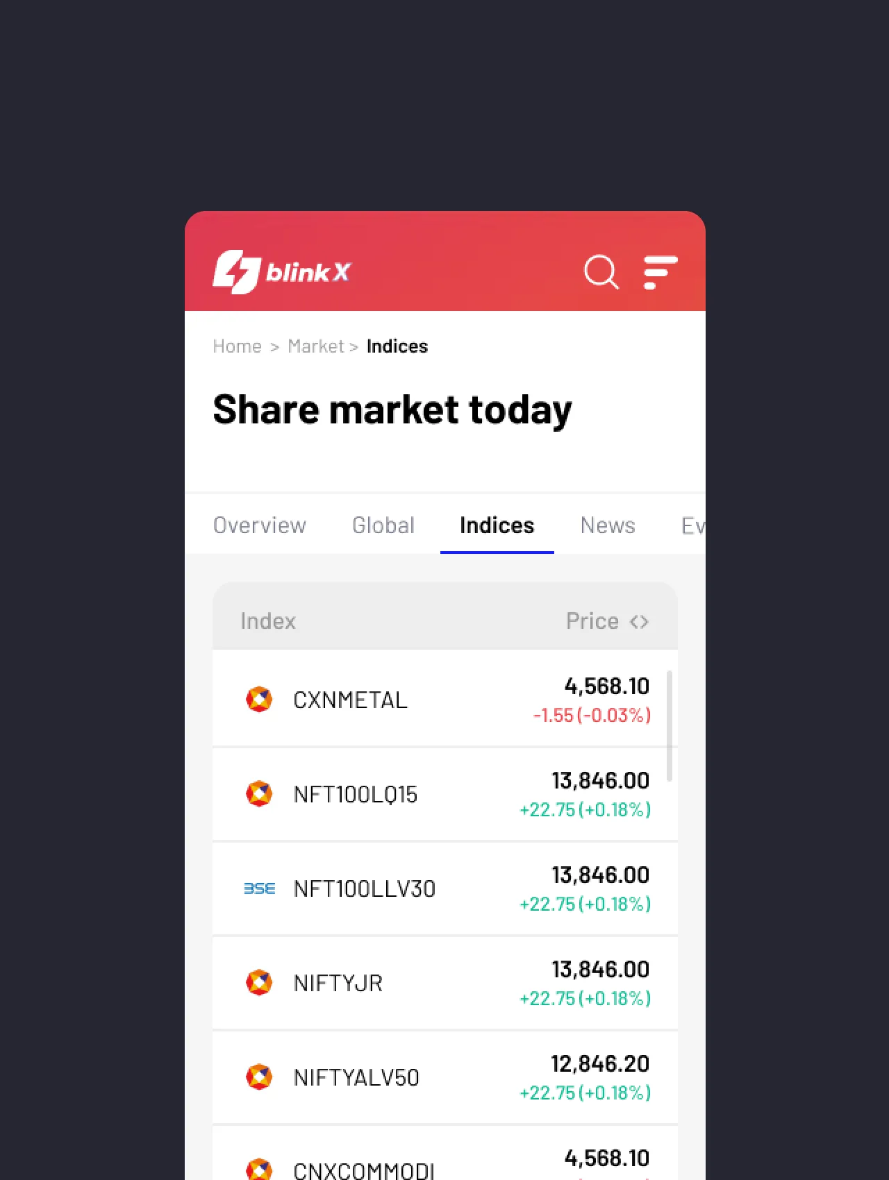
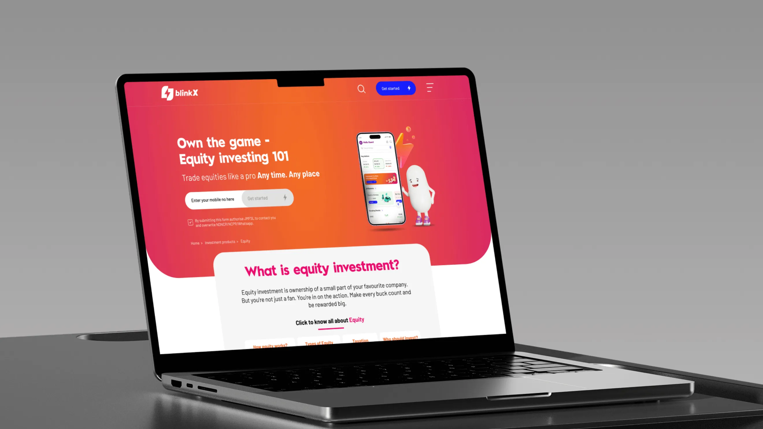
BlinkX aimed to democratise equity investments for new-age users by providing a beginner-friendly platform that blends intuitive design with powerful financial tools.
We partnered with BlinkX to build a user-centric investment app that simplifies the complexities of stock trading, especially for Gen-Z and millennial audiences.
Lorem ipsum dolor sit amet, consectetur adipiscing elit, sed do eiusmod tempor incididunt ut labore et dolore magna aliqua. Ut enim ad minim veniam, quis nostrud exercitation ullamco laboris nisi ut aliquip ex ea commodo consequat. Duis aute irure dolor in reprehenderit in voluptate velit esse cillum dolore eu fugiat nulla pariatur.
Block quote
Ordered list
Unordered list
Bold text
Emphasis
Superscript
Subscript


Unintuitive Navigation for First-Time Users
Users had difficulty finding essential actions like portfolio view, order history, or live market updates due to cluttered menus.
Lack of Visual Identity Consistency
Early designs lacked brand personality and failed to emotionally connect with young users.
Low User Engagement with Educational Content
Users were skipping or ignoring long blocks of text explaining how equity investment works.
The goal was to revamp the platform to make financial discovery easy, trustworthy, and personalised. We aim to improve user engagement, product clarity, and brand credibility. The platform should promote financial literacy and empower users to make confident decisions.
We designed a peppy learning flow with step-by-step cards, mascot illustrations, and a friendlier bottom navigation - shaped by heat-maps and analytics to highlight the most-used actions.
A fresh design system brought gradients, rounded shapes, and cheerful avatars into play, creating a welcoming visual tone. Custom mascots and illustrations gave the experience personality and charm. Every colour, typeface, and icon was applied with precision for consistency across mobile and desktop.
The result — a product that feels both playful and intuitive, winning user trust from the first tap.

Lorem ipsum dolor sit amet, consectetur adipiscing elit, sed do eiusmod tempor incididunt ut labore et dolore magna aliqua. Ut enim ad minim veniam, quis nostrud exercitation ullamco laboris nisi ut aliquip ex ea commodo consequat. Duis aute irure dolor in reprehenderit in voluptate velit esse cillum dolore eu fugiat nulla pariatur.
Block quote
Ordered list
Unordered list
Bold text
Emphasis
Superscript
Subscript


For Business Enquiry
info@prismicreflections.comFor Career Opportunities:
Apply NowOffice Location
Prismic Reflections® is a principal-led, award-winning design studio that blends human empathy, strategic thinking & innovation to solve high-stakes business challenges through strategic design, from the past 23 years.


