Every project teaches you something.
But every once in a while, a project completely changes the way you approach design.
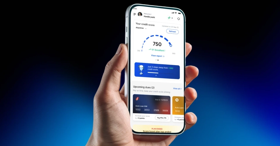
For me, that project was ScoreUp—a smart financial wellness platform that helps users understand and improve their credit health through AI-driven insights, personalized recommendations, loan discovery, bill payments, and financial tracking.
When I joined the project, I thought my responsibility was simple: design beautiful interfaces.
By the end of the project, I realized my real responsibility was designing an entire product experience.
The First Challenge: Proving My Design Thinking
Like many client engagements, the journey started with a small challenge.
Instead of handing over the entire product, the client first wanted to evaluate my design capabilities. I was asked to redesign only two or three screens. I explored two completely different visual directions.
The first direction focused on a modern interface enhanced with 3D icons and premium visual effects. The second direction used custom illustrations to make financial concepts feel more approachable, human, and trustworthy. Both directions solved the same problem differently.
The client ultimately chose the illustration-based approach because it aligned better with the brand's vision of making finance simple and less intimidating. That decision became the visual foundation for the entire product.
From Three Screens to Forty
Once the visual direction was finalized, the real challenge began. The client wanted nearly 40 screens redesigned within just 15 - 18 days. An earlier UX structure already existed, but I was given complete freedom to rethink interactions, layouts, hierarchy, and overall usability wherever improvements were needed.
Every day became a challenge.
Not just to design another screen but to ensure every screen felt fresh, consistent, intuitive, and visually engaging while maintaining a cohesive product experience. I learned that consistency across dozens of screens is far more difficult than creating one impressive interface.
Phase Two Changed Everything
After successfully completing Phase One, the product expanded. New modules were introduced, including vouchers, bill payments, and loan offers. Unlike Phase One, many of these features had no wireframes.
At the same time, the client wanted even more creativity in the experience, so the challenge was not only to design functional screens but also to make them feel fresh, engaging, and visually distinctive. The client wanted to discuss business requirements while we were actively designing. This meant understanding the business logic, defining user flows, thinking through edge cases, and designing the UI all at the same time.
Initially, this felt overwhelming.
Looking back, it became the biggest learning opportunity of the project.
Learning to Think Like a Product Designer
Working closely with the Product Manager completely changed my perspective.
Instead of asking, "How should this screen look?"
I started asking,
- What problem is this feature solving?
- What is the user's goal?
- What information is most important at this stage?
- What could confuse the user?
- What happens if something goes wrong?
I realized that users never experience one screen in isolation. They experience an entire journey. Designing complete journeys is Product Design.
Collaboration Creates Better Products
This project also showed me how valuable cross-functional collaboration really is.
Design decisions became stronger through constant discussions with Product Managers, Developers, QA engineers, and stakeholders. Developers helped me understand technical limitations, implementation effort, reusable patterns, and why some interactions needed alternative approaches. Rather than designing in isolation, we designed together. That collaboration made the final product far more practical and scalable.
Balancing Creativity with Responsibility
While the design work itself was exciting, managing the project over three months brought a completely different set of challenges. Everyday involved calls, design reviews, feedback sessions, planning discussions with the Product Manager and development team. Alongside this, I had to meet aggressive timelines without compromising the quality of the experience.
There were days when requirements changed, new features were introduced, and priorities shifted overnight. The real challenge wasn't just creating great designs it was staying adaptable while maintaining consistency across the entire product. This experience taught me that being a senior designer is about much more than designing screens. It's about managing expectations, communicating clearly with stakeholders, making thoughtful design decisions under pressure, and ensuring quality even when timelines are tight.
Design Doesn't End in Figma
One lesson I'll carry throughout my career is this:
A design isn't complete when the mockups are approved. It's complete only when users experience it exactly as intended. After development, I spent significant time testing the application. Initially, I was only checking whether the UI matched the designs. Soon I realized that's only a small part of quality assurance.
A product should also be evaluated for:
- Page loading performance
- Form validation
- Empty states
- Error handling
- Success messages
- Edge-case scenarios
- Responsiveness
- Micro-interactions
- Accessibility
- Navigation flow
- Overall usability
Many issues only become visible once the product is functional. Those discoveries helped improve both the user experience and the overall product quality. Looking Beyond Individual Screens.
Another important realization was that every design decision affects another part of the product. Changing one interaction could simplify onboarding. Improving one dashboard could reduce customer support queries. A clearer hierarchy could improve feature discovery.
Good design creates a ripple effect throughout the product. That level of thinking only comes from understanding the entire ecosystem—not just individual pages.
Seeing the Product in Users' Hands
One of the most rewarding moments came after months of research, design iterations, collaboration, development, and testing.
Today, ScoreUp is live on the Google Play Store, allowing real users to improve and manage their financial health through the experience we built together. Seeing the product earn a 4.3-star rating has been incredibly satisfying not because of the number itself, but because it reflects positive user experiences and validates the countless design decisions made throughout the project.
My Biggest Takeaway
When I started this project, my goal was to create interfaces that looked impressive. By the time we completed Phase Two, my goal had changed completely.
Today, I don't measure success by how beautiful a screen looks. I measure it by how easily users achieve their goals, how efficiently developers can build it, how confidently the business can scale it, and how consistently the experience works across the entire product.
This project reminded me that great designers don't simply create beautiful screens. They connect business goals, user needs, technology, and collaboration into one seamless experience. And that's the mindset I'll carry into every project that comes next.