


Prismic Reflections® is a principal-led, award-winning design studio that blends human empathy, strategic thinking & innovation to solve high-stakes business challenges through strategic design, from the past 23 years.

Wins A’ Design Award in 2023 for Intelehealth App UX/UI Design


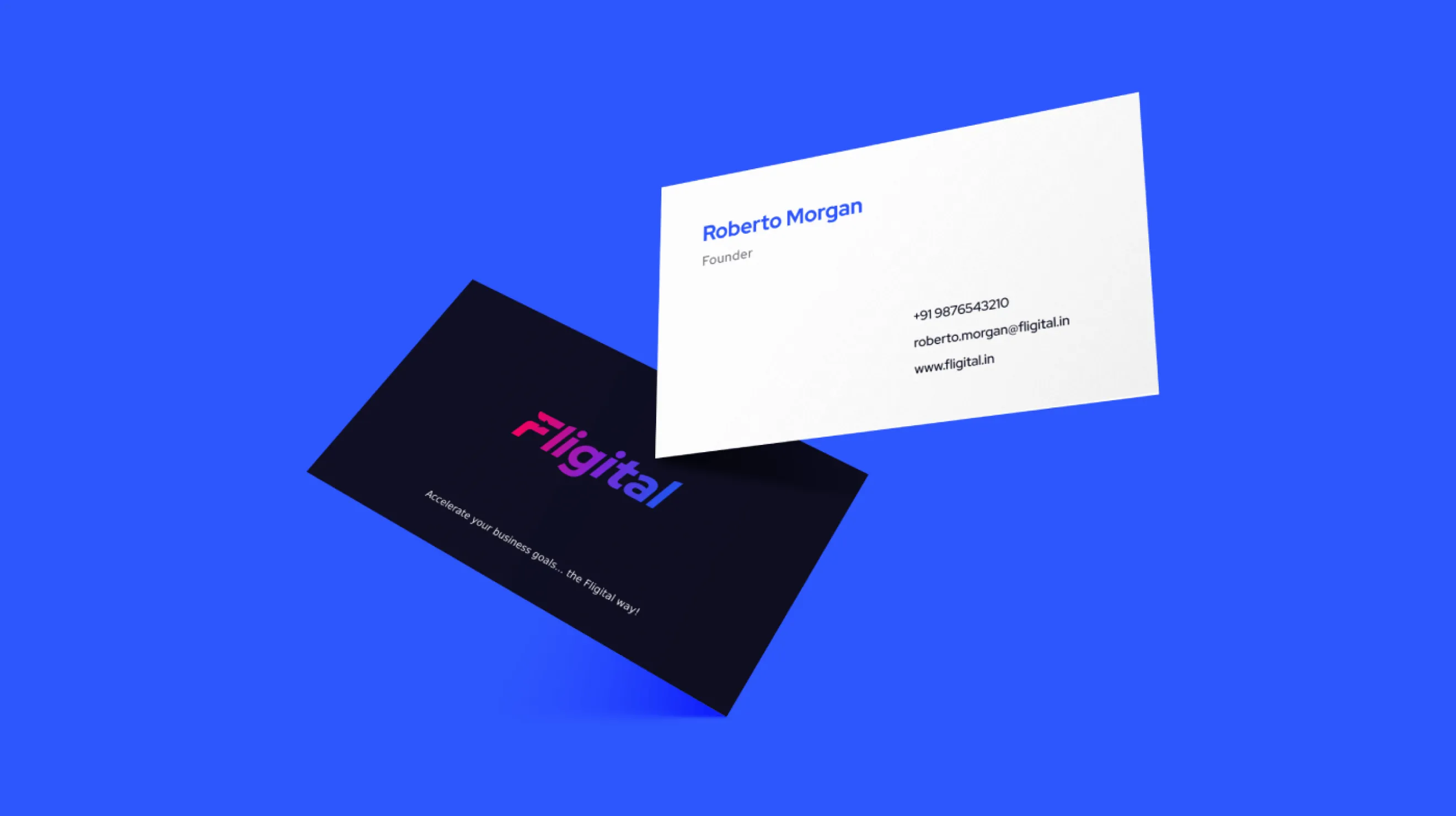
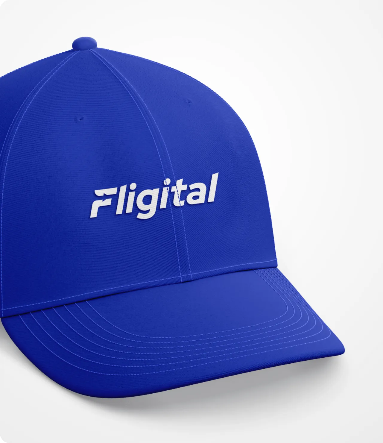
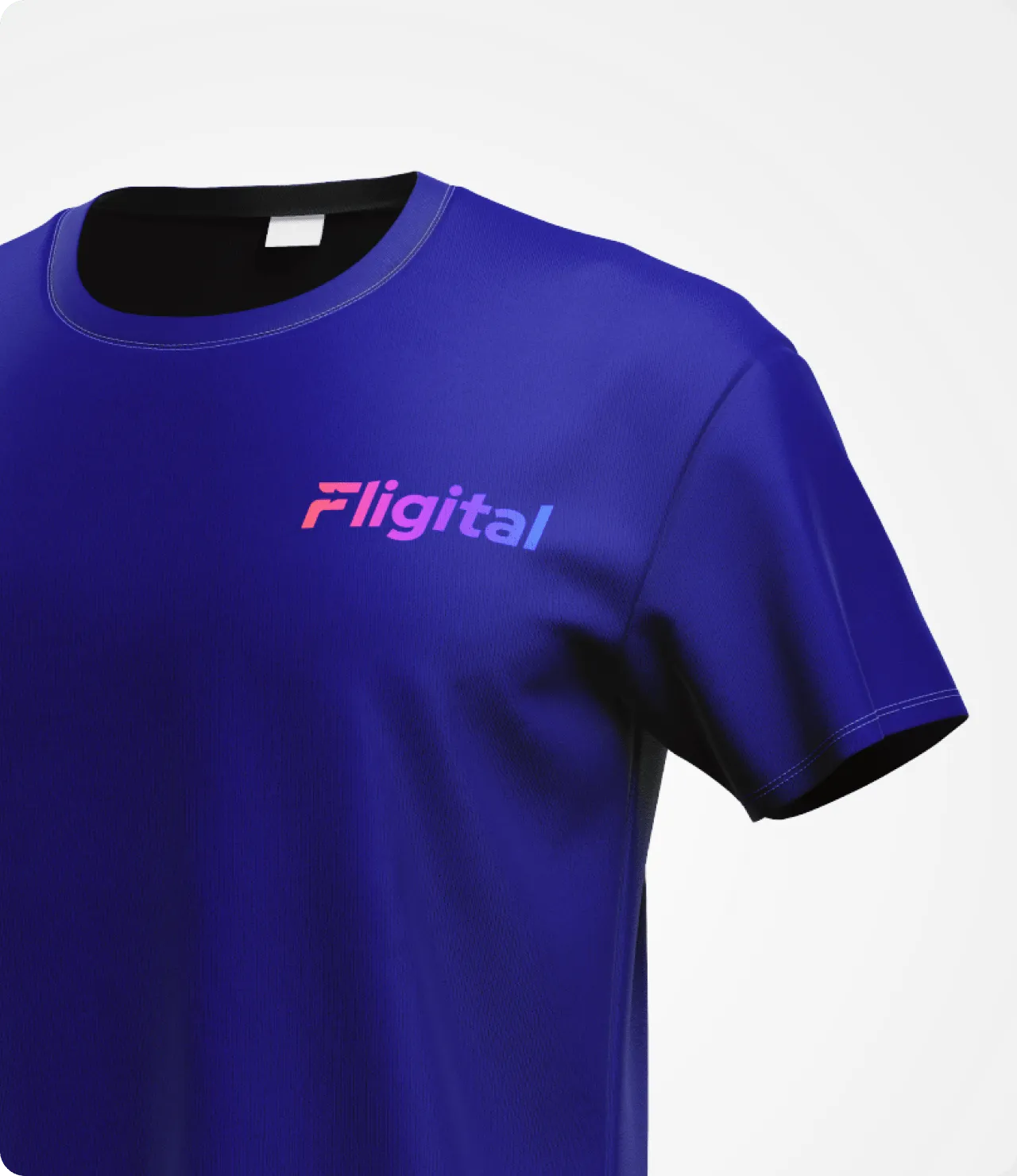
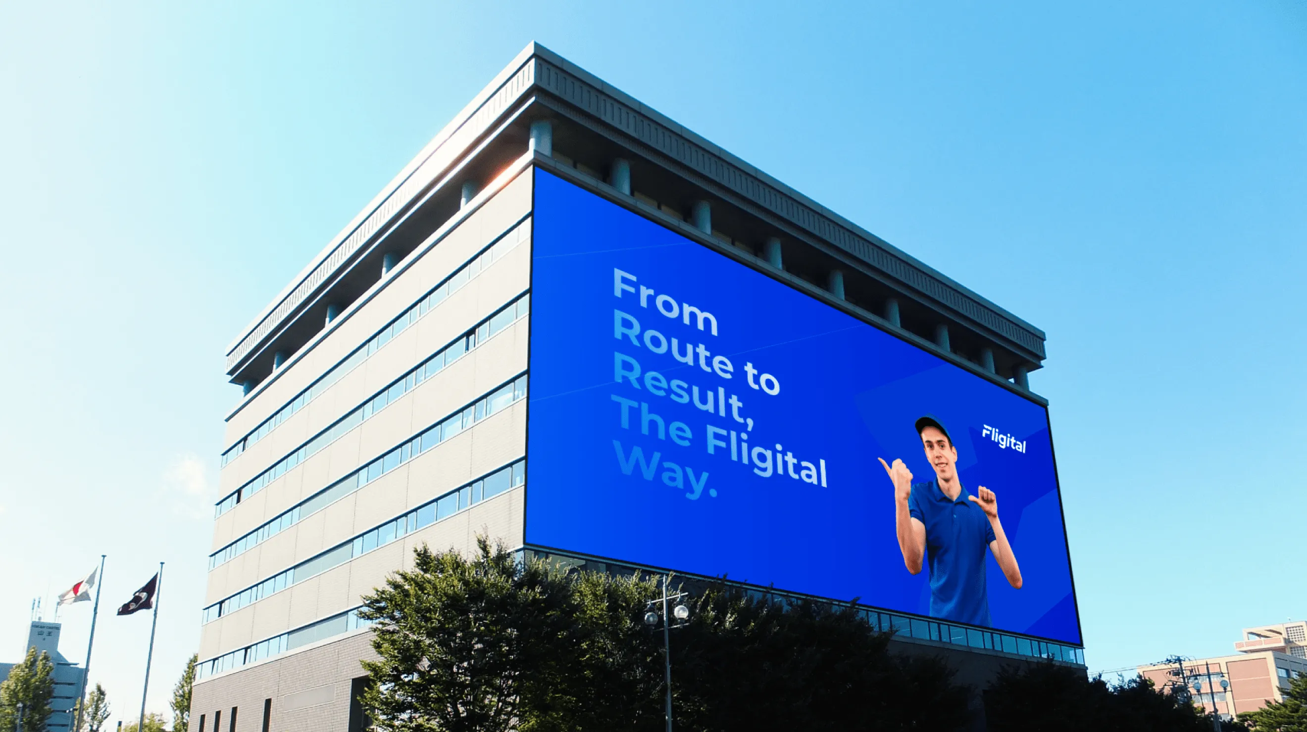
Fligital was born out of real conversations with professionals in the Transport and Logistics industry, highlighting common operational challenges and inefficiencies. What began as an effort to help friends soon evolved into a digital fleet management system aimed at streamlining data, optimizing operations, and enabling fleet managers to focus on what matters most.
Lorem ipsum dolor sit amet, consectetur adipiscing elit, sed do eiusmod tempor incididunt ut labore et dolore magna aliqua. Ut enim ad minim veniam, quis nostrud exercitation ullamco laboris nisi ut aliquip ex ea commodo consequat. Duis aute irure dolor in reprehenderit in voluptate velit esse cillum dolore eu fugiat nulla pariatur.
Block quote
Ordered list
Unordered list
Bold text
Emphasis
Superscript
Subscript


Designing the Fligital logo meant balancing its tech-driven nature with its human-centric origins. With no existing identity, the challenge was to convey speed, efficiency, and trust through typography alone—without a logomark. The goal was to reflect both the digital intelligence and physical realities of trucking, while keeping the design modern, relatable, and distinctly Indian.
The creative brief for Fligital’s logo focused on crafting a clean, modern, typography-based wordmark that reflects digital transformation in fleet operations. The design needed to convey speed, clarity, and trust while remaining approachable. Custom tweaks to a bold sans-serif typeface were explored to subtly suggest motion, direction, and operational strength.
During brainstorming, we explored custom lettering styles with forward-leaning angles, stretched strokes, and integrated arrow or path-like shapes to evoke movement. We also considered using road-inspired cuts or directional cues subtly embedded in the typography. To reflect the platform’s digital side, we thought about incorporating small elements like motion lines or dots within or around the letterforms to suggest connectivity and flow. References were drawn from both Indian logistics brands and international transport identities to guide the visual direction while keeping the output original and relevant.


Lorem ipsum dolor sit amet, consectetur adipiscing elit, sed do eiusmod tempor incididunt ut labore et dolore magna aliqua. Ut enim ad minim veniam, quis nostrud exercitation ullamco laboris nisi ut aliquip ex ea commodo consequat. Duis aute irure dolor in reprehenderit in voluptate velit esse cillum dolore eu fugiat nulla pariatur.
Block quote
Ordered list
Unordered list
Bold text
Emphasis
Superscript
Subscript


For Business Enquiry
info@prismicreflections.comFor Career Opportunities:
Apply NowOffice Location
Prismic Reflections® is a principal-led, award-winning design studio that blends human empathy, strategic thinking & innovation to solve high-stakes business challenges through strategic design, from the past 23 years.


