


Prismic Reflections® is a principal-led, award-winning design studio that blends human empathy, strategic thinking & innovation to solve high-stakes business challenges through strategic design, from the past 23 years.

Wins A’ Design Award in 2023 for Intelehealth App UX/UI Design


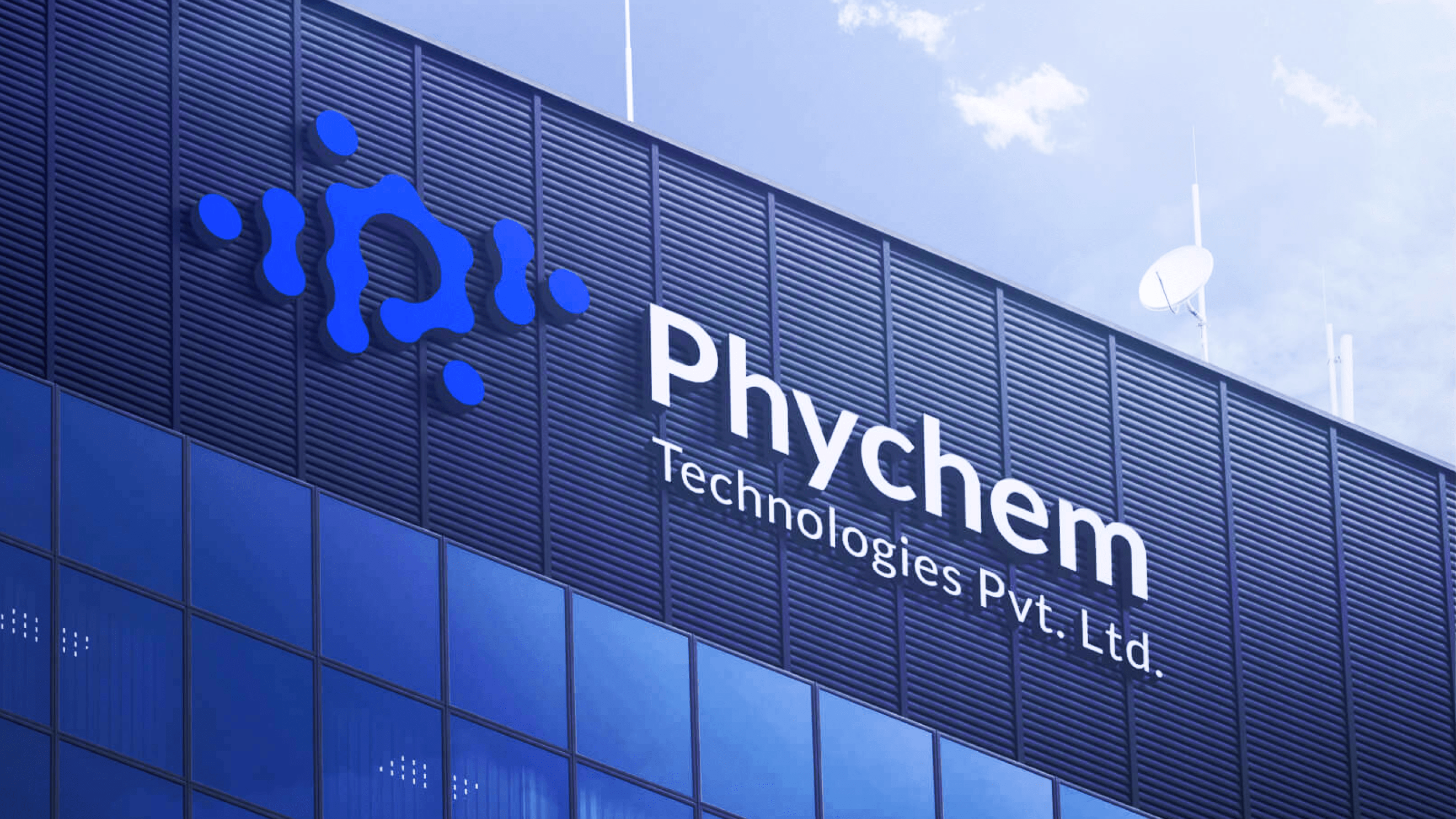
Finolace is a financial advisory brand that provides expert research-based insights and educational resources for investors and traders in the Indian stock market. The brand seeks to build trust and financial confidence through clarity, knowledge, and integrity. The goal of this project was to craft a logo identity that captures the brand's promise of “peaceful financial growth.”
Lorem ipsum dolor sit amet, consectetur adipiscing elit, sed do eiusmod tempor incididunt ut labore et dolore magna aliqua. Ut enim ad minim veniam, quis nostrud exercitation ullamco laboris nisi ut aliquip ex ea commodo consequat. Duis aute irure dolor in reprehenderit in voluptate velit esse cillum dolore eu fugiat nulla pariatur.
Block quote
Ordered list
Unordered list
Bold text
Emphasis
Superscript
Subscript


Despite the growing importance of financial literacy, few brands have successfully bridged the gap between expert financial analysis and accessible education. Additionally, the financial sector often lacks user-friendly digital platforms that cater to both seasoned investors and beginners. Finolace aimed to position itself as a forward-thinking brand by offering sophisticated financial insights and educational tools, all within an intuitively designed, technology-driven platform.
The logo needed to reflect Finolace’s core values: trust, expertise, and tranquility in financial journeys. It had to be modern, minimal, and distinct—evoking confidence while being approachable and calming.
The design also needed to be flexible for various applications, from educational content and mobile interfaces to investor communication tools.
During the ideation phase, we explored concepts inspired by keywords such as Star (guidance), Checkmark (accuracy), Balance (stability), Collaboration (connection), Wings (growth), Plus (value addition), and Paper (research and insights). These elements helped shape a visual language that conveys trust and progress.
We experimented with clean geometric forms, soft curves, and balanced symmetry to reflect harmony and structure. Typography was carefully chosen to be modern and sans-serif, with subtle customizations to evoke professionalism, clarity, and warmth.
Lorem ipsum dolor sit amet, consectetur adipiscing elit, sed do eiusmod tempor incididunt ut labore et dolore magna aliqua. Ut enim ad minim veniam, quis nostrud exercitation ullamco laboris nisi ut aliquip ex ea commodo consequat. Duis aute irure dolor in reprehenderit in voluptate velit esse cillum dolore eu fugiat nulla pariatur.
Block quote
Ordered list
Unordered list
Bold text
Emphasis
Superscript
Subscript


For Business Enquiry
info@prismicreflections.comFor Career Opportunities:
Apply NowOffice Location
Prismic Reflections® is a principal-led, award-winning design studio that blends human empathy, strategic thinking & innovation to solve high-stakes business challenges through strategic design, from the past 23 years.


