Meet DigiNotice
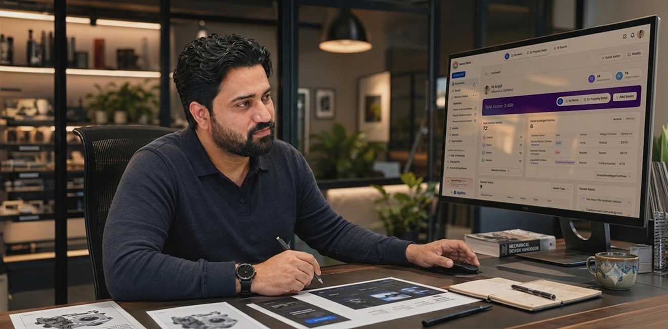
Imagine a bank manager about to approve a ₹2 crore loan. Right before signing off, they realise they need to check if the borrower or property is tied up in any legal notices published in newspapers.
That used to mean digging through stacks of daily papers, searching complex legal databases, or relying on manual word-of-mouth checks.
DigiNotice changed that. It is India's first unified public notice intelligence platform—a digital tool that scans, organises, and indexes legal notices from hundreds of newspapers nationwide, turning messy print data into searchable insights.
The Real Problem Wasn't the UI
When clients approach a UX studio, they often start by saying, "We need a fresh UI."Sometimes that’s true, but this wasn't one of those times. The old version had all the features, but doing basic everyday tasks took way too much effort. Users had access to thousands of legal notices, custom reports, exports, dashboards, and data tables. But finding a simple answer felt like trying to finish a massive task right before your next meeting.
The bigger issue?
The exact same screens were shown to bank loan officers, legal advocates, and corporate compliance teams—even though each of them was trying to do something totally different.
Technically, the features were all there. Practically, it was overwhelming. Users kept asking: "What do I click next?"
Before Figma, we started with research & our notebook.

To solve this, we didn't jump straight into drawing screens. We actually spent time using the DigiNotice platform ourselves first, acting like everyday users so we could spot the friction points firsthand.
From there, we conducted in-depth user interviews and held interactive stakeholder workshops. We ran product walkthrough demos with actual users to dig deep into how they navigate data under pressure.
That research revealed three distinct user types:
- The Bank Manager: Needs a quick, high-confidence "yes" or "no" answer on property or individual risk before clearing a loan.
- The Legal Researcher: Needs deep filter controls, exact keyword matches, and verifiable print-notice proofs.
- The Corporate Compliance Lead: Needs automated alerts, bulk tracking, and exportable audit reports.
Search Should Feel Like a Conversation, Not an Exam

In the original design, searching for a notice meant filling out long forms with dates, categories, publication names, and location codes. If you missed one parameter, you got zero results.
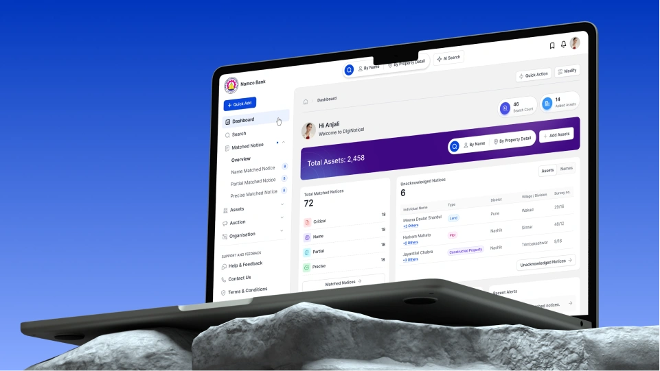
We completely redesigned the search interface around intent instead of parameters.Now, users can type in plain language—like a person's name, survey number, or company name—and the platform intelligently presents categorised matches instantly.
Making Legal Data Feel Less... Legal
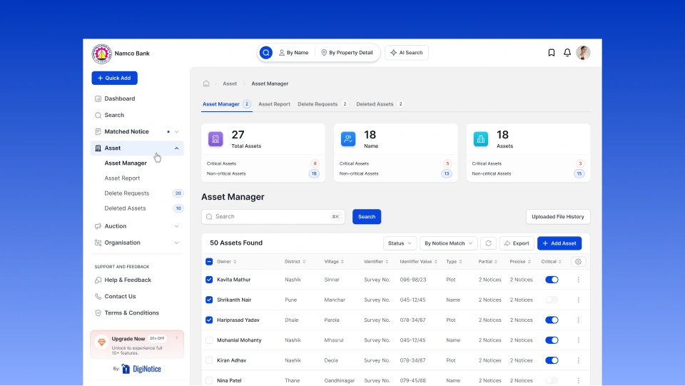
Legal notices are naturally dense, packed with heavy terminology, small fonts, and legalese.We restructured how notice details are displayed on screen. Instead of throwing a wall of raw text at the user, we broke the layout into clear, bite-sized sections:
- Key Entities Identified: Instantly highlights names, property addresses, and legal claim types.
- Notice Source & Proof: Displays the original newspaper clipping alongside digitized text.
- Actionable Next Steps: Direct options to bookmark, flag, download PDF proofs, or share with legal counsel.
The Platform Learned Some Manners
We also wanted the platform to feel proactive rather than reactive. Instead of requiring users to log in every morning and run the same manual searches, we designed an automated alert system.
Users can save specific watchlists (e.g., specific land survey numbers or high-value clients), and DigiNotice automatically notifies them the second a matching notice appears in any publication nationwide.
More Than a Redesign
Redesigning DigiNotice wasn't just about making screens look clean and modern. It was about taking a complex, information-heavy domain and turning it into a tool that helps professionals make high-stakes financial and legal decisions with total confidence. To learn more about how we built the web and mobile experiences, check out our full case studies:
Explore our Enterprise Page to see how we design intuitive experiences for complex Enterprise and AI products.
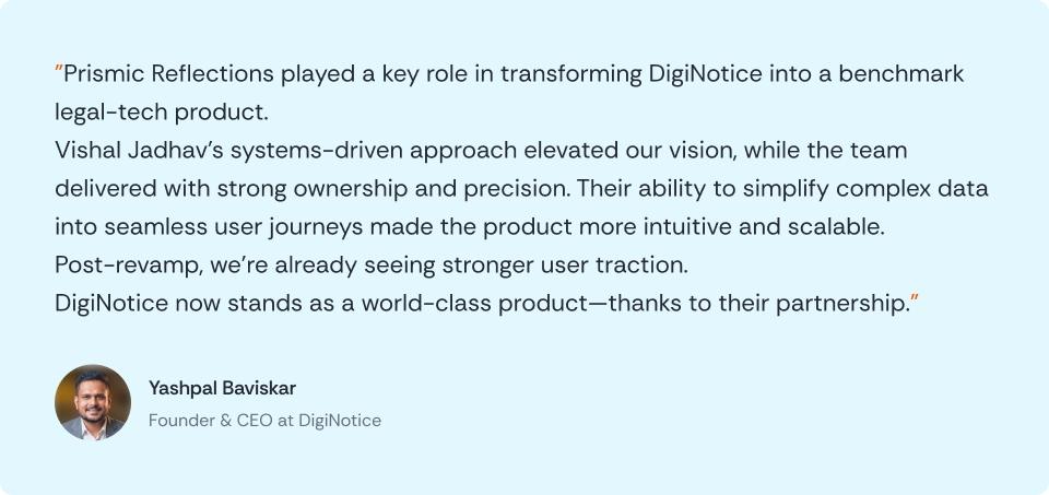
Client Feedback