


Prismic Reflections® is a principal-led, award-winning design studio that blends human empathy, strategic thinking & innovation to solve high-stakes business challenges through strategic design, from the past 23 years.

Wins A’ Design Award in 2023 for Intelehealth App UX/UI Design

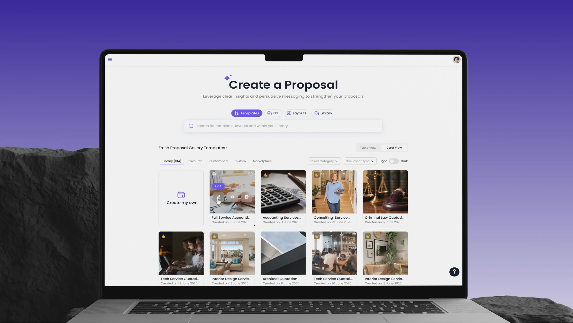
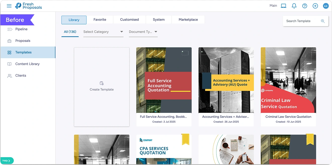
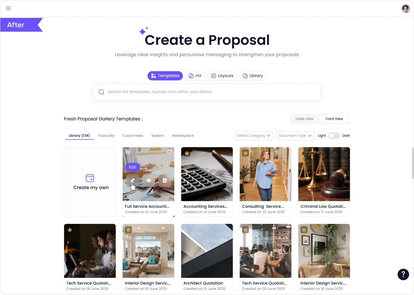
Fresh Proposal is a proposal-creation platform for business owners, finance, and sales teams to build and send quotations quickly.
The existing editor created friction—users felt overwhelmed, confused by editing modes, and often dropped off mid-way.
Prismic Reflections partnered with Fresh Proposal to redesign the editor end-to-end with a UX-first approach, improved visuals, and scalable systems.
Lorem ipsum dolor sit amet, consectetur adipiscing elit, sed do eiusmod tempor incididunt ut labore et dolore magna aliqua. Ut enim ad minim veniam, quis nostrud exercitation ullamco laboris nisi ut aliquip ex ea commodo consequat. Duis aute irure dolor in reprehenderit in voluptate velit esse cillum dolore eu fugiat nulla pariatur.
Block quote
Ordered list
Unordered list
Bold text
Emphasis
Superscript
Subscript


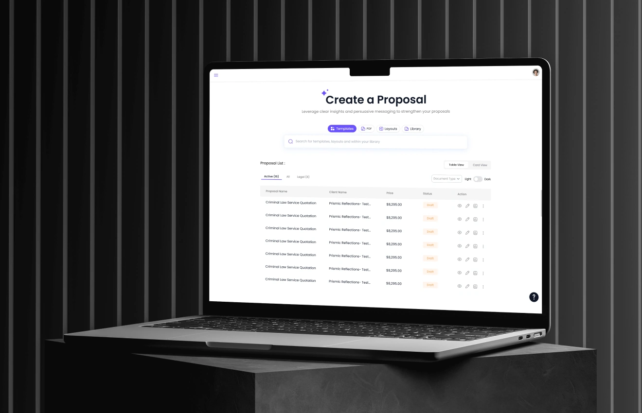
Before: The editor loaded with too many visible options at once, offering no clear starting point for users. This lack of guidance led to immediate cognitive overload, causing users to feel overwhelmed within the first few seconds and contributing to a high bounce rate from the editor landing page.
After: A clear primary action (Start / Edit / Use Template) was prominently highlighted to guide user entry. Advanced options were progressively disclosed within a clean layout supported by strong visual hierarchy, making the editor feel structured, intuitive, and far less intimidating.
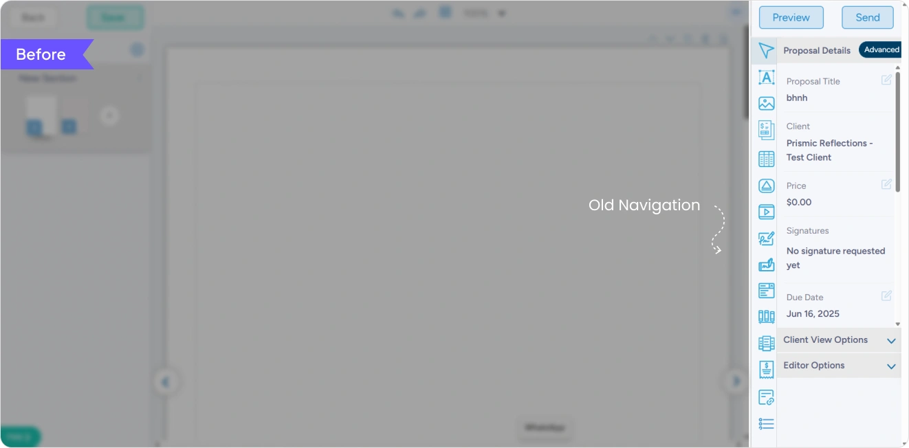
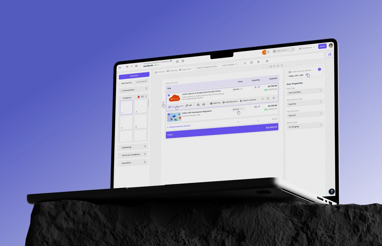
Before: The navigation was flat, with too many options presented at the same level and no clear separation between basic and advanced actions. As a result, users struggled to locate frequently used tools and experienced mental overload due to poor grouping and lack of hierarchy.
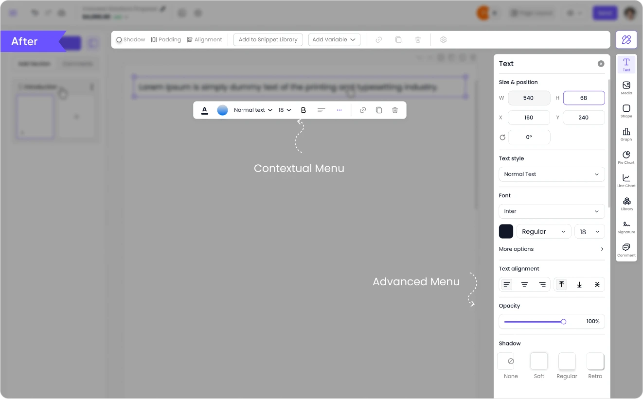
After: A two-level menu structure was introduced to establish clear hierarchy, separating core actions from advanced features. Navigation was reorganised around user tasks, enabling logical grouping and faster access to high-frequency actions, resulting in a more efficient and intuitive experience.
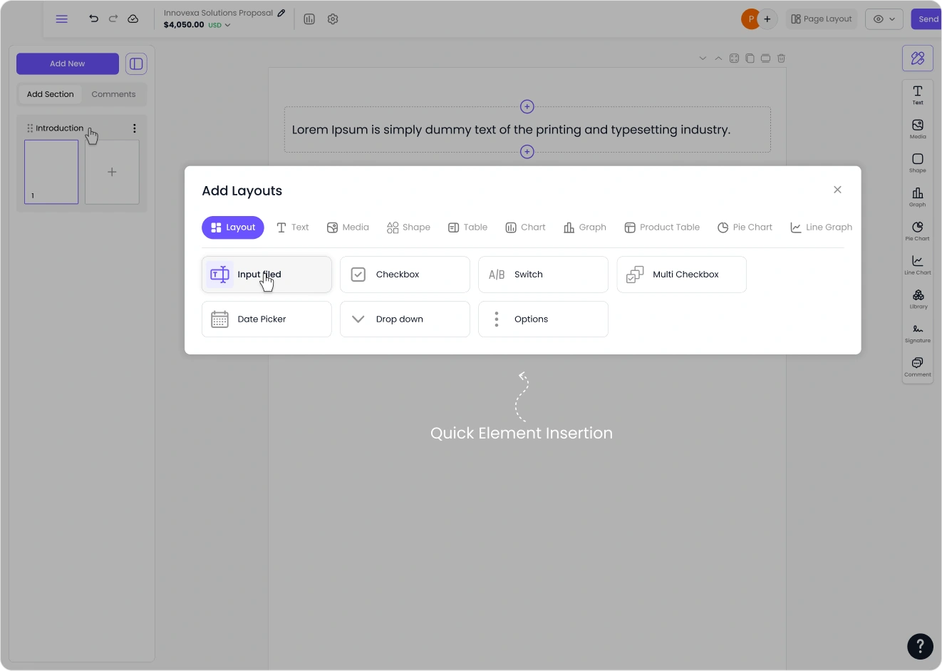
Users can easily expand their document by hovering a section and clicking the inline “+” control to add new elements exactly where they are needed. This reduces unnecessary steps and allows users to build their proposals faster without interrupting their workflow.
Lorem ipsum dolor sit amet, consectetur adipiscing elit, sed do eiusmod tempor incididunt ut labore et dolore magna aliqua. Ut enim ad minim veniam, quis nostrud exercitation ullamco laboris nisi ut aliquip ex ea commodo consequat. Duis aute irure dolor in reprehenderit in voluptate velit esse cillum dolore eu fugiat nulla pariatur.
Block quote
Ordered list
Unordered list
Bold text
Emphasis
Superscript
Subscript


For Business Enquiry
info@prismicreflections.comFor Career Opportunities:
Apply NowOffice Location
Prismic Reflections® is a principal-led, award-winning design studio that blends human empathy, strategic thinking & innovation to solve high-stakes business challenges through strategic design, from the past 23 years.


